Boost Inc. - Branding
Boost is a human resources consultancy that wanted to communicate in a warmer, more recognizable way. We developed a visual world that could carry its identity across channels and formats.
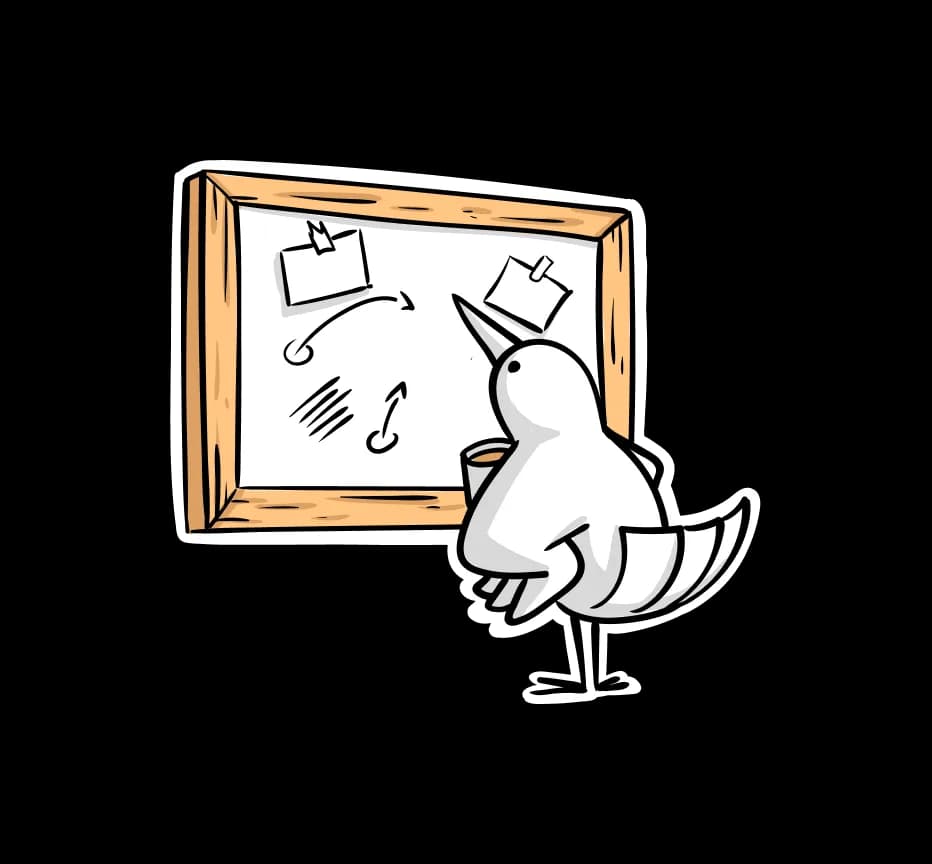
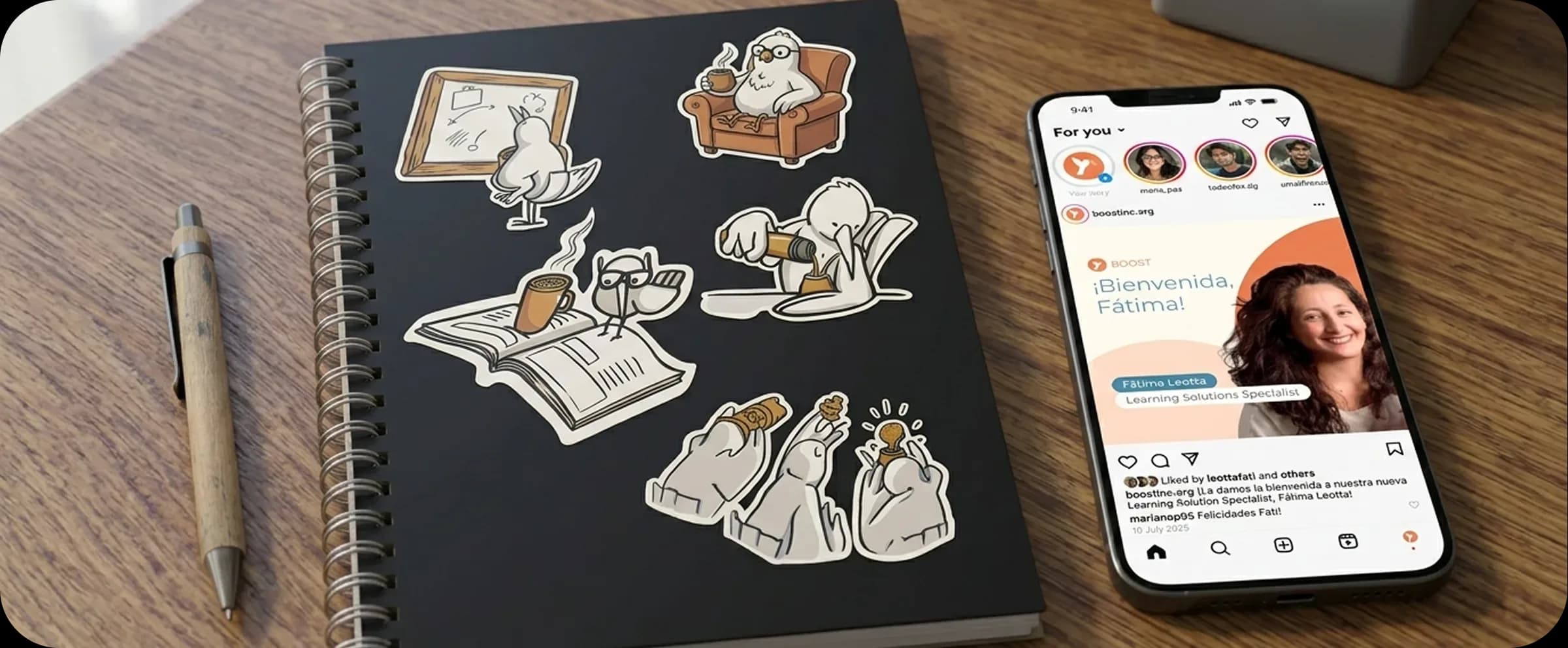
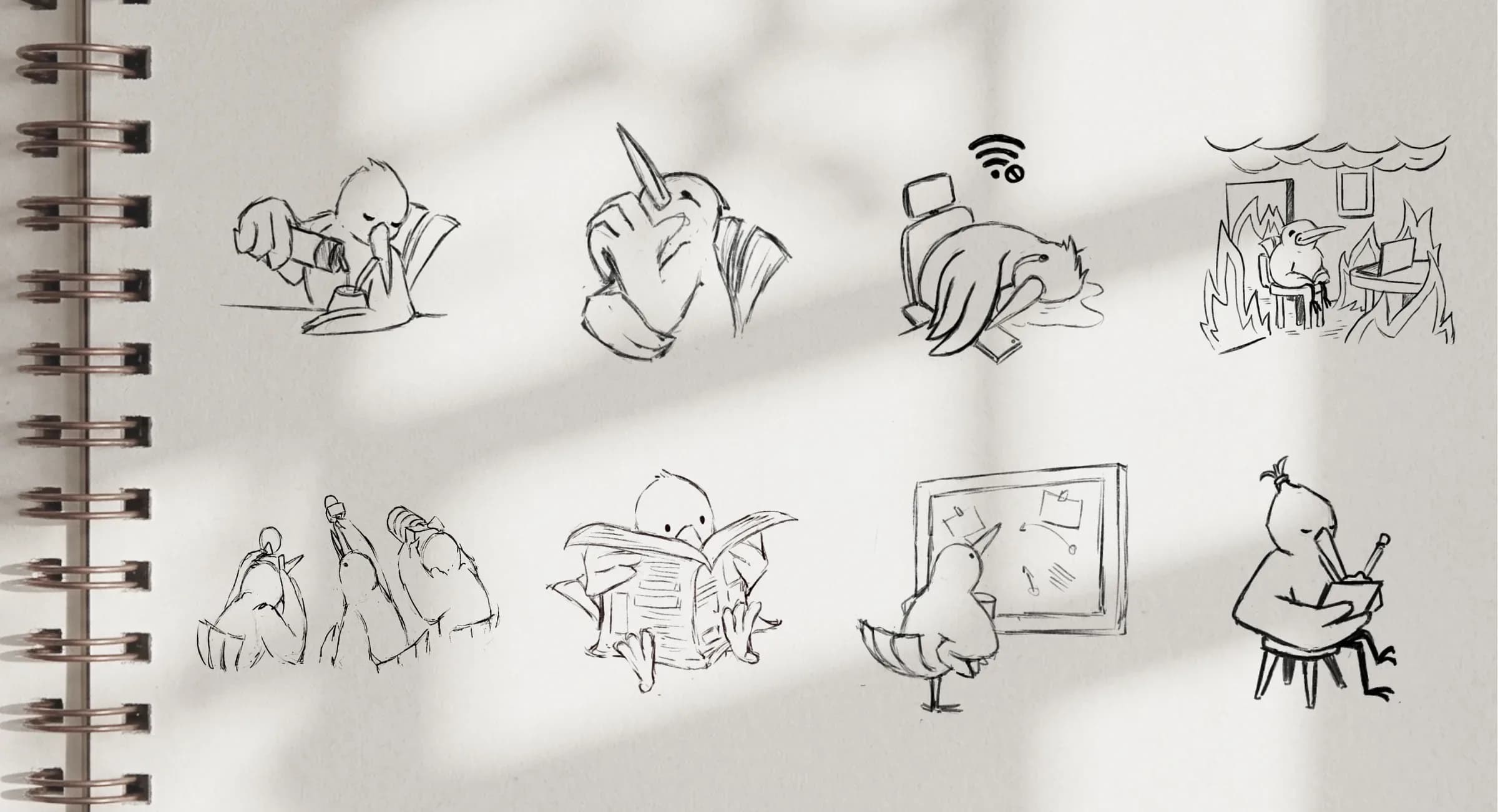
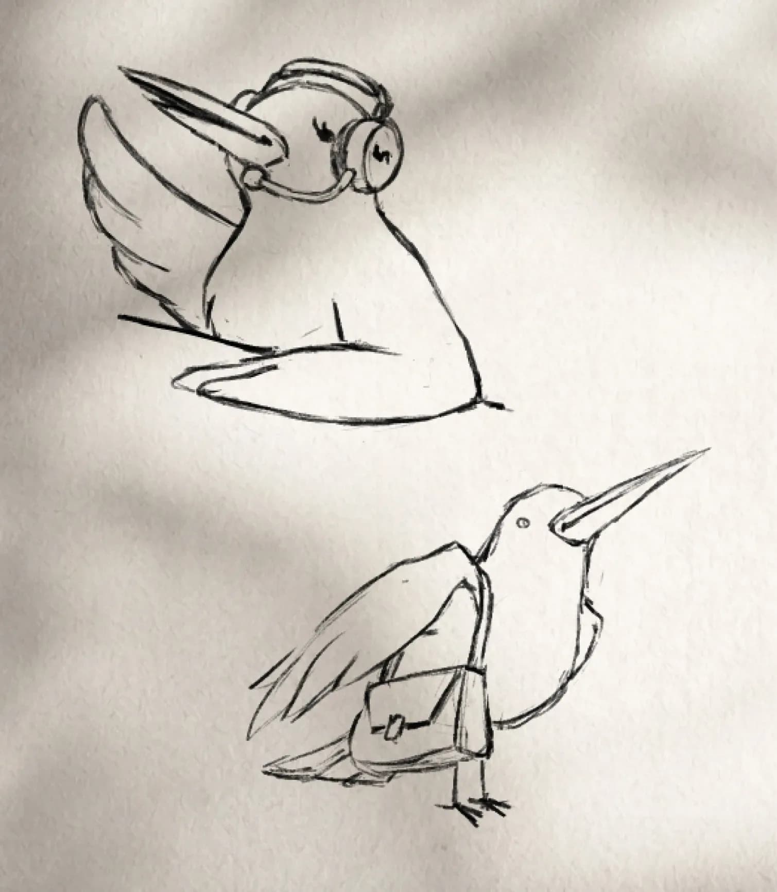
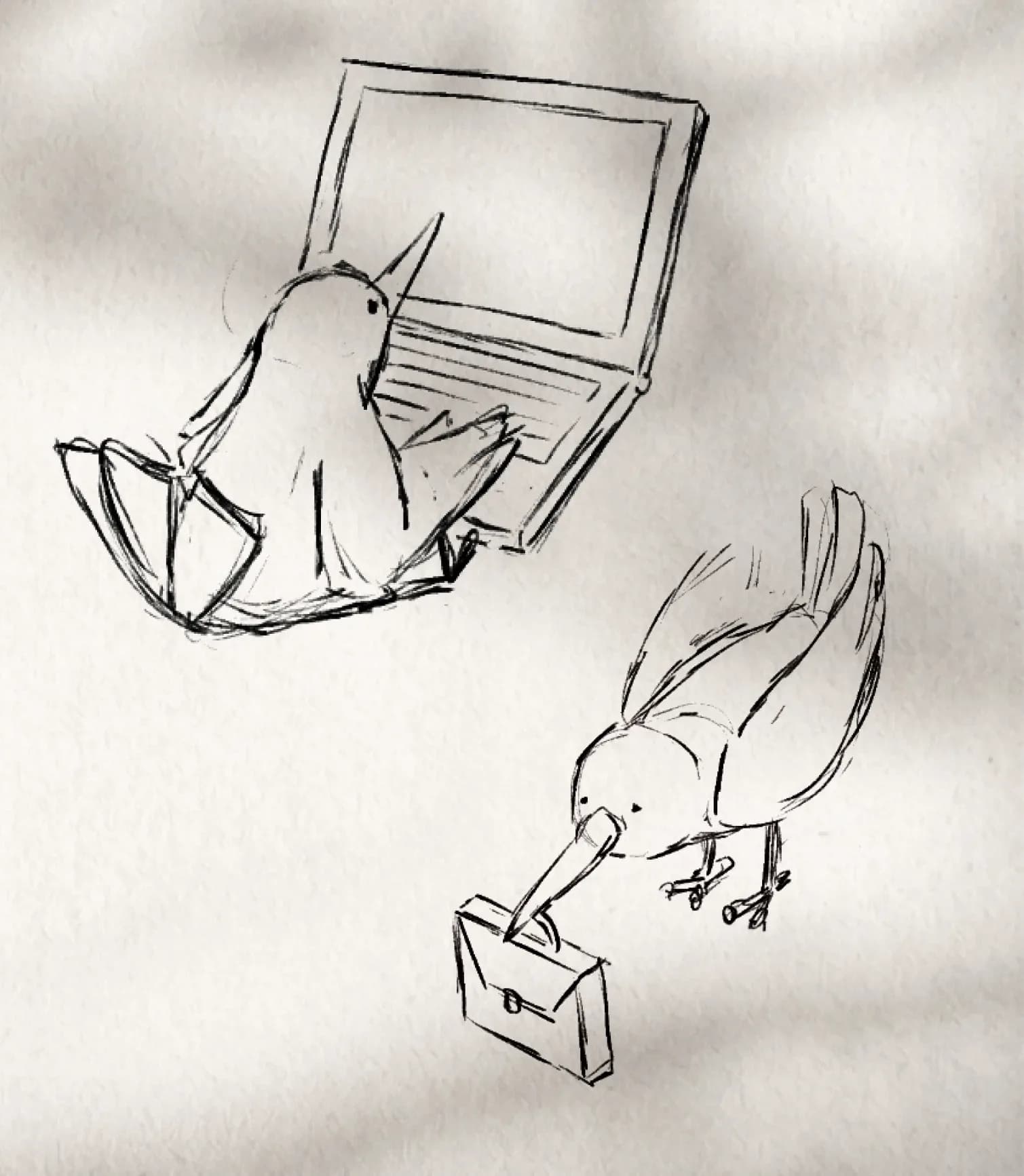
We created an illustrated mascot that became the brand's distinguishing feature.
Context
Boost came to Hard Fork with an established logo but no visual system built around it. We developed the identity alongside the new website, using both parts of the project to create a shared visual language.
Problem
The logo needed a broader visual world to support the brand's communication.
Objective
Create a recognizable, flexible language for Boost's different channels.
Approach
Develop original assets that expand the identity and support the brand's communication.
Challenge
The challenge was to make the identity more recognizable and approachable across formats, maintaining a consistent aesthetic without losing the flexibility each piece required.
Solution
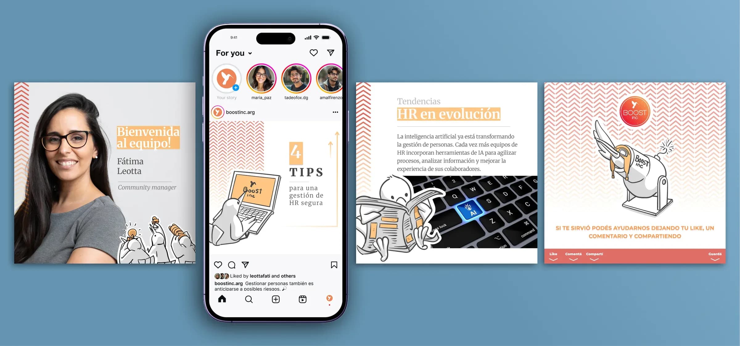
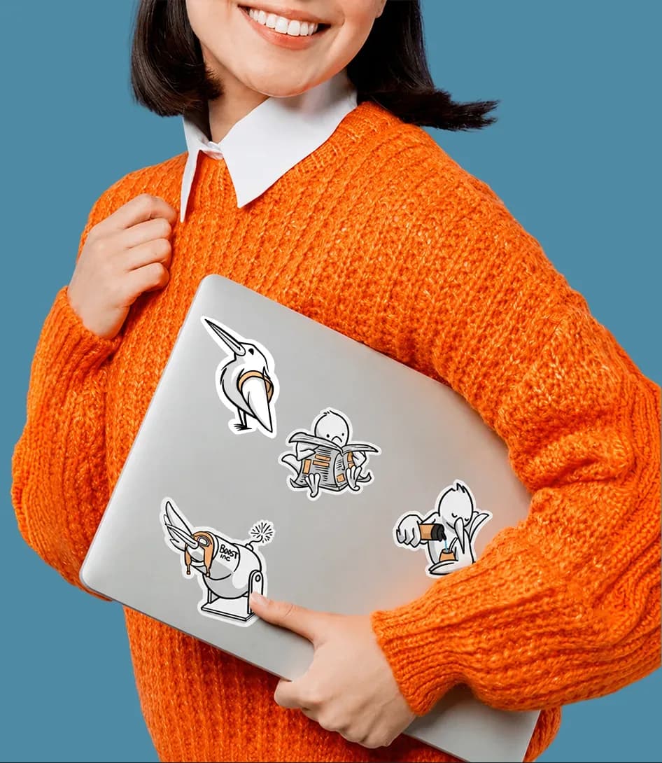
We developed a system of graphic assets to support Boost's communication in different contexts. It includes an illustrated mascot, a series of original illustrations, templates for social media and presentations, and pieces such as stickers.
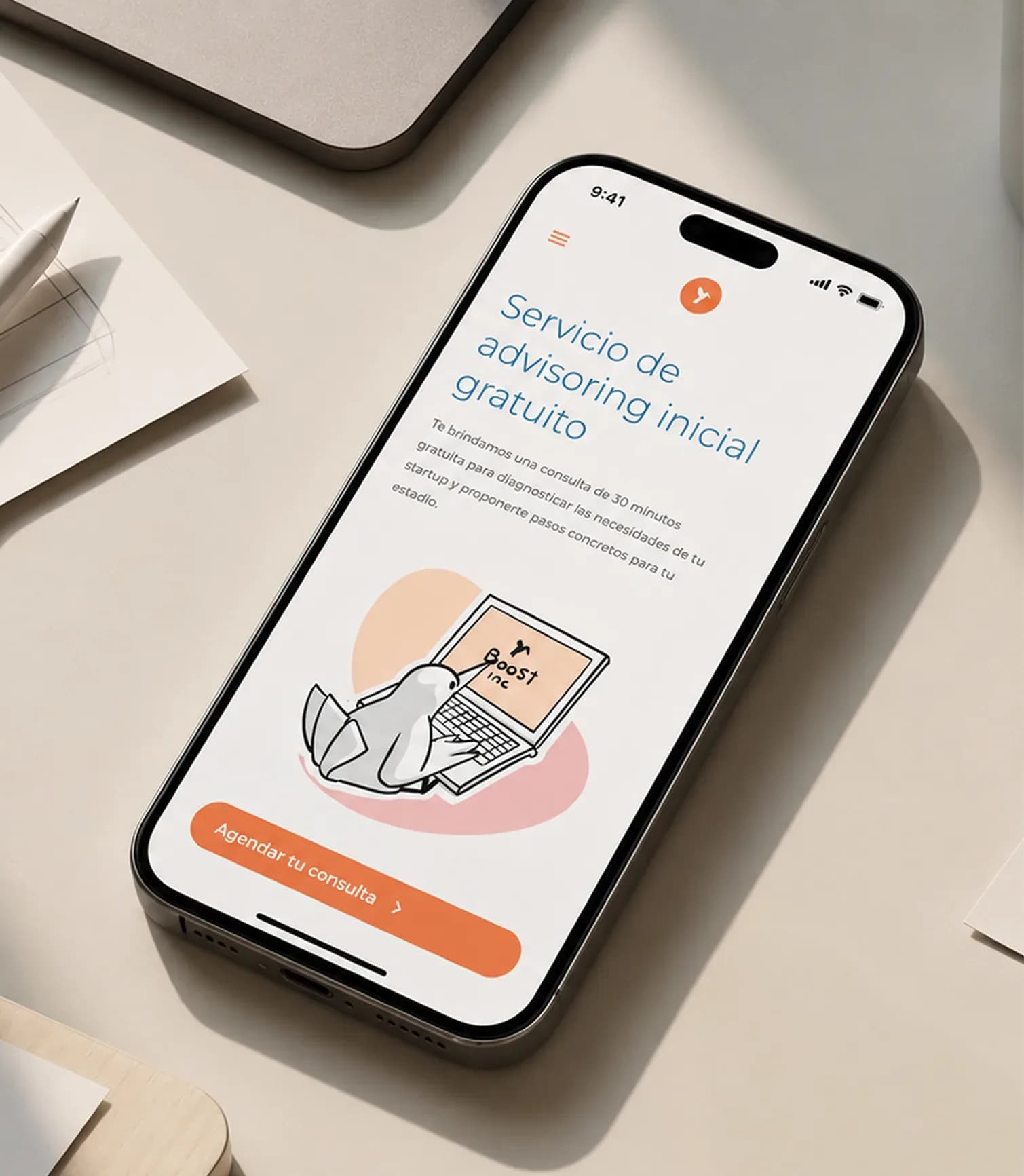
We developed the visual language alongside the website, combining photography and illustration to create a shared aesthetic across all the pieces.
Outcome
Boost's visual world grew to include original assets for different communication needs. The mascot, illustrations, and templates help maintain a consistent aesthetic across social media, presentations, and other materials.