Sorelio - Branding
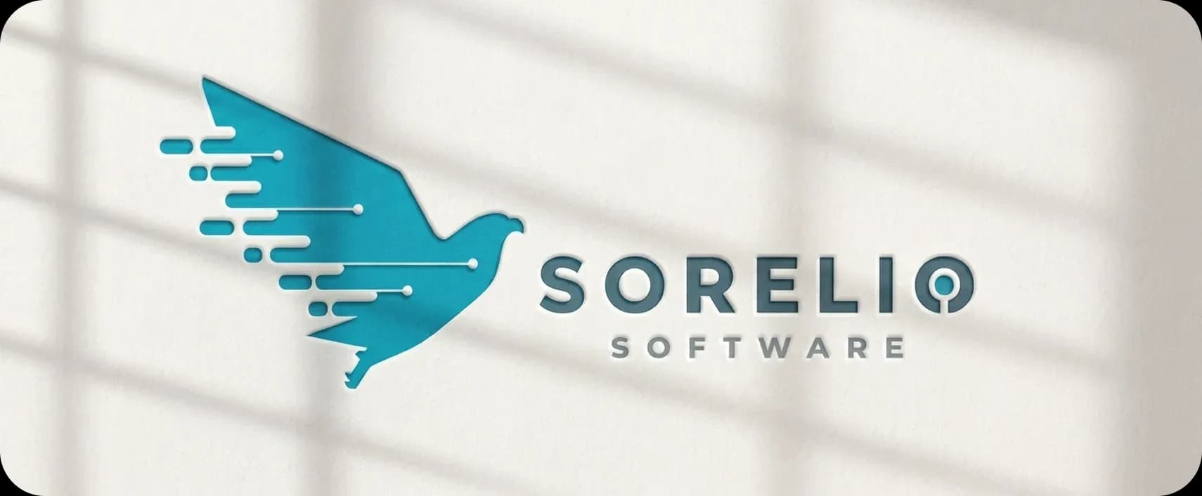
Sorelio is a Czech custom software development company. We created a visual identity that gives the brand a personality of its own in the technology sector.
The eagle became the heart of an identity designed to grow alongside the company.
Context
Sorelio was founded in 2020 as a development company and needed to define its identity from the start. The project called not only for a brand mark, but for a visual system that could work across applications and stay consistent as the company grew.
Problem
Sorelio needed to stand out in a market where many brands use similar visual codes.
Objective
Build a recognizable brand ready to grow with the company.
Approach
Develop a visual system that unifies the brand's communication across contexts.
Challenge
We had to create an identity for a young technology company without confining it to the industry's usual visual language. The system needed to work for brand communication as well as corporate and promotional applications.
Solution
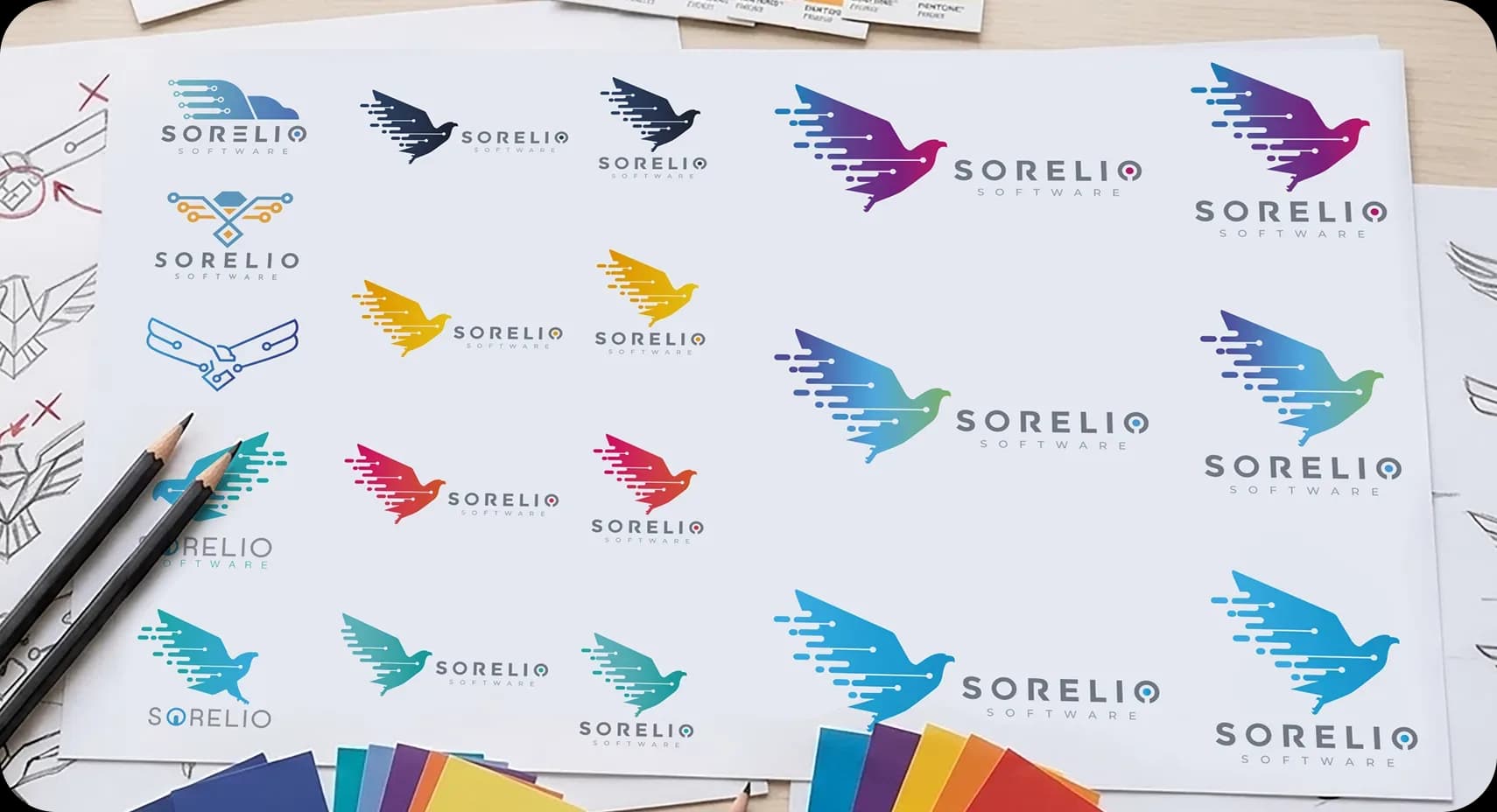
We explored different ways to build the symbol, looking for a visual language connected to Sorelio's technology work. Early concepts followed two directions: an eagle and structures based on nodes and connections.
The eagle emerged as the central element, leading to a visual system that draws on the language of technology and software development. We defined the brand's elements and their uses in a guide.
Outcome
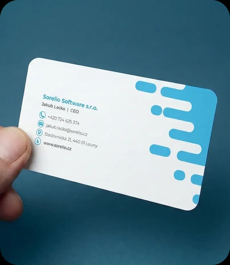
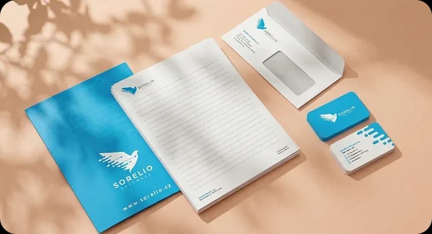
We carried the identity across the company's materials, including stationery, visuals for workspaces, and promotional products, applying it consistently in each format.