Gotten Gym - Premium Sport Club
Gotten is a premium gym in Huesca, Spain. We created a visual identity designed to convey strength, movement, and a sense of exclusivity.
In an industry that often shouts, Gotten chose the restraint of a premium brand.
Context
Gotten came to Hard Fork to create its brand identity and a visual system that would work consistently across touchpoints.
The project covered the brand mark, typography, color palette, applications, and a guide documenting the full system.
Problem
The identity needed a clearer, more consistent visual direction.
Objective
Create an identity that combines strength and movement with a premium feel.
Approach
A visual system with a distinctive mark, restrained palette, and consistent applications.
Challenge
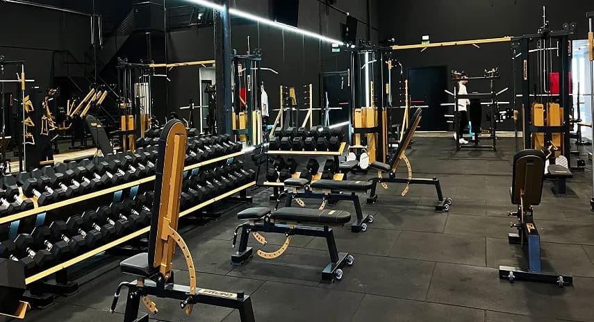
The identity needed to express Gotten's premium positioning and stand apart from conventional gym visuals, while remaining recognizable and easy to use across formats.
Solution
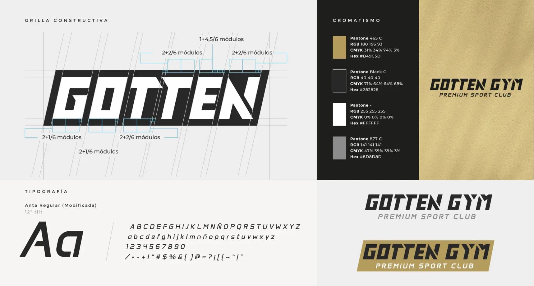
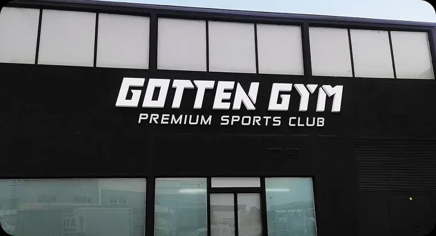
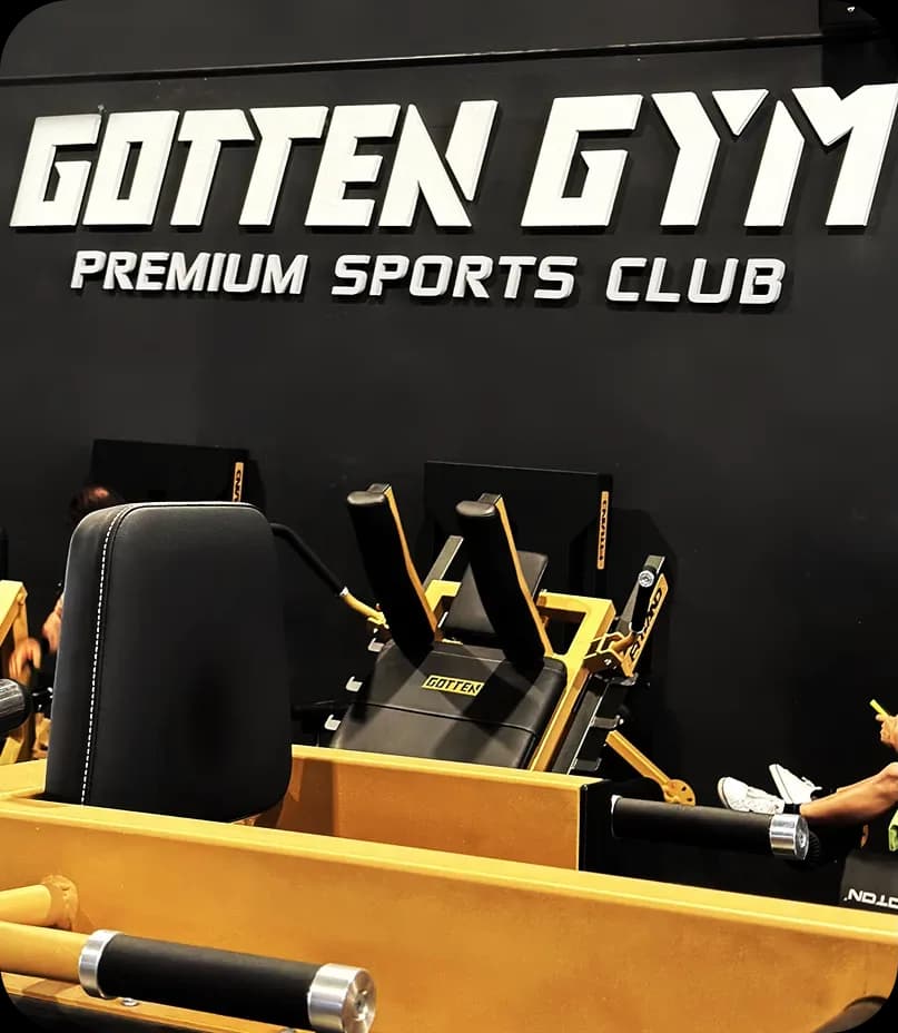
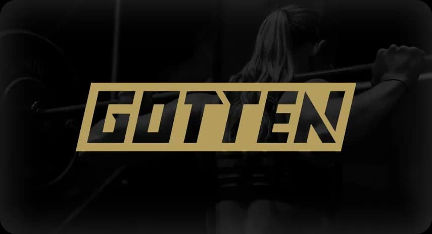
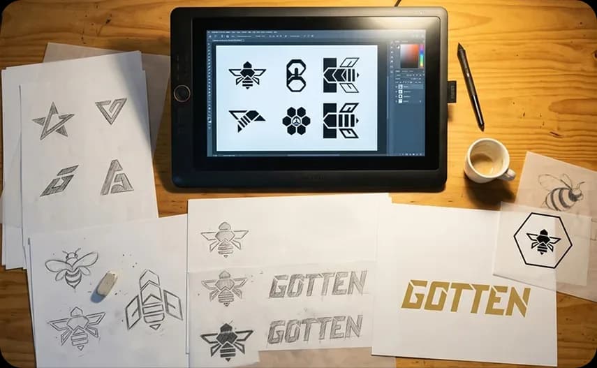
We developed an identity that pairs dynamism with a premium aesthetic, moving away from the visual conventions of most gyms. Typography conveys movement and strength, while the palette creates a more restrained presence associated with an exclusive space.
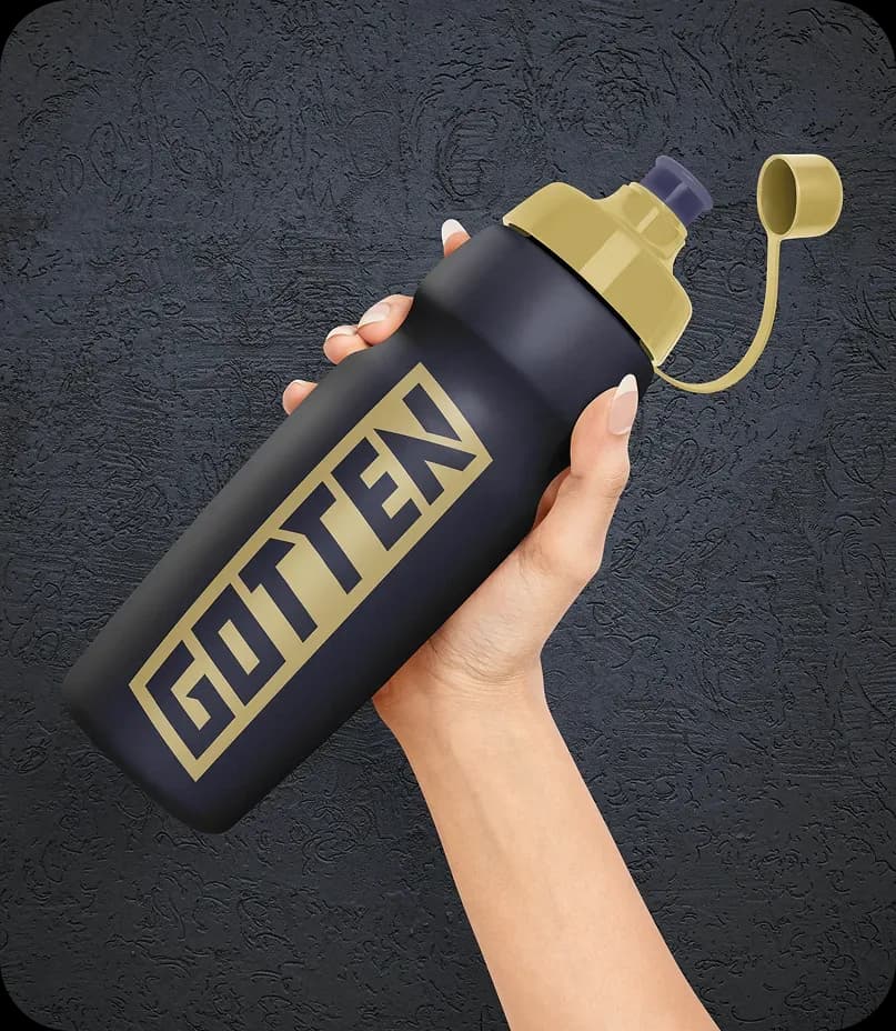
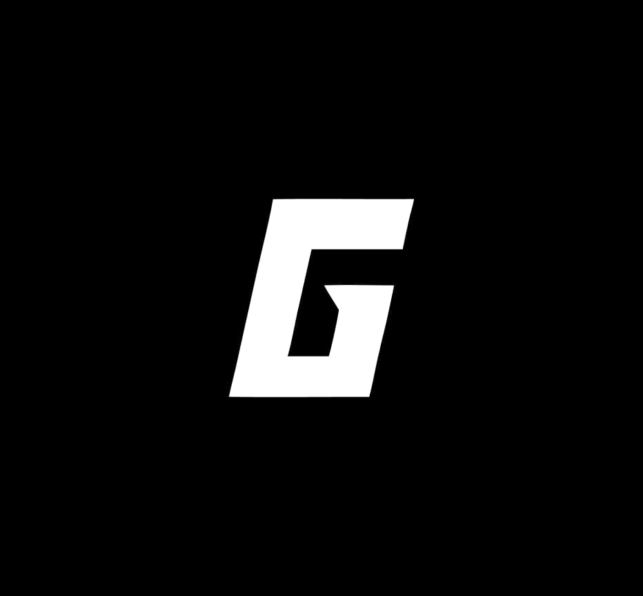
We also designed the system to adapt across formats, from the main brand mark to compact versions for spaces where the full logo would not work.
Outcome
The final identity uses a customized version of the Anta typeface, tilted 12 degrees to give it the character defined during the design process. The palette combines deep black with muted gold, and a compact mark works in square and circular formats such as social media avatars and icons.
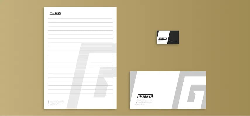
A brand guide documents versions for light and dark backgrounds and reversed applications, along with a construction grid defining proportions, margins, and letter spacing. We also applied the identity to letterhead, business cards, and envelopes, and specified minimum sizes for digital and print use.